Building Brand Consistency Across Multiple Platforms
You post on Instagram. You run Facebook ads. You send email newsletters. You have a website. Maybe you're on LinkedIn too. And Google Ads. And...
Each platform has its own format, its own culture, its own audience behavior. How do you maintain a consistent brand identity across all of them without losing your mind—or requiring a full-time designer?
This guide breaks down the practical approach to brand consistency for growing businesses operating across multiple channels.
Why Consistency Actually Matters
Before the "how," let's clarify the "why."
Recognition Compounds
Every time someone sees your brand, they either:
- Recognize it → Trust builds, familiarity increases
- Don't recognize it → You're starting from zero again
Consistent visual identity means every touchpoint reinforces the last. Inconsistent branding means you're constantly introducing yourself.
The Numbers
Research from Lucidpress found that consistent brand presentation increases revenue by an average of 23%. Consistency doesn't just feel professional—it directly impacts the bottom line.
The Practical Reality
Inconsistent branding happens when:
- Different team members create content with different approaches
- Platform-specific adjustments drift too far from core identity
- Speed pressure leads to "good enough" instead of "on-brand"
- Brand guidelines exist but aren't followed or accessible
The Brand Consistency Framework
Think of brand consistency across three dimensions:
1. Visual Consistency
The stuff people see:
- Colors
- Fonts
- Logo usage
- Image style
- Layout patterns
2. Voice Consistency
How you sound:
- Tone (formal vs. casual)
- Vocabulary choices
- Messaging themes
- Personality traits
3. Experience Consistency
How interactions feel:
- Response time
- Customer service style
- Friction points
- Quality expectations
For this guide, we'll focus primarily on visual consistency—the most visible and controllable element.
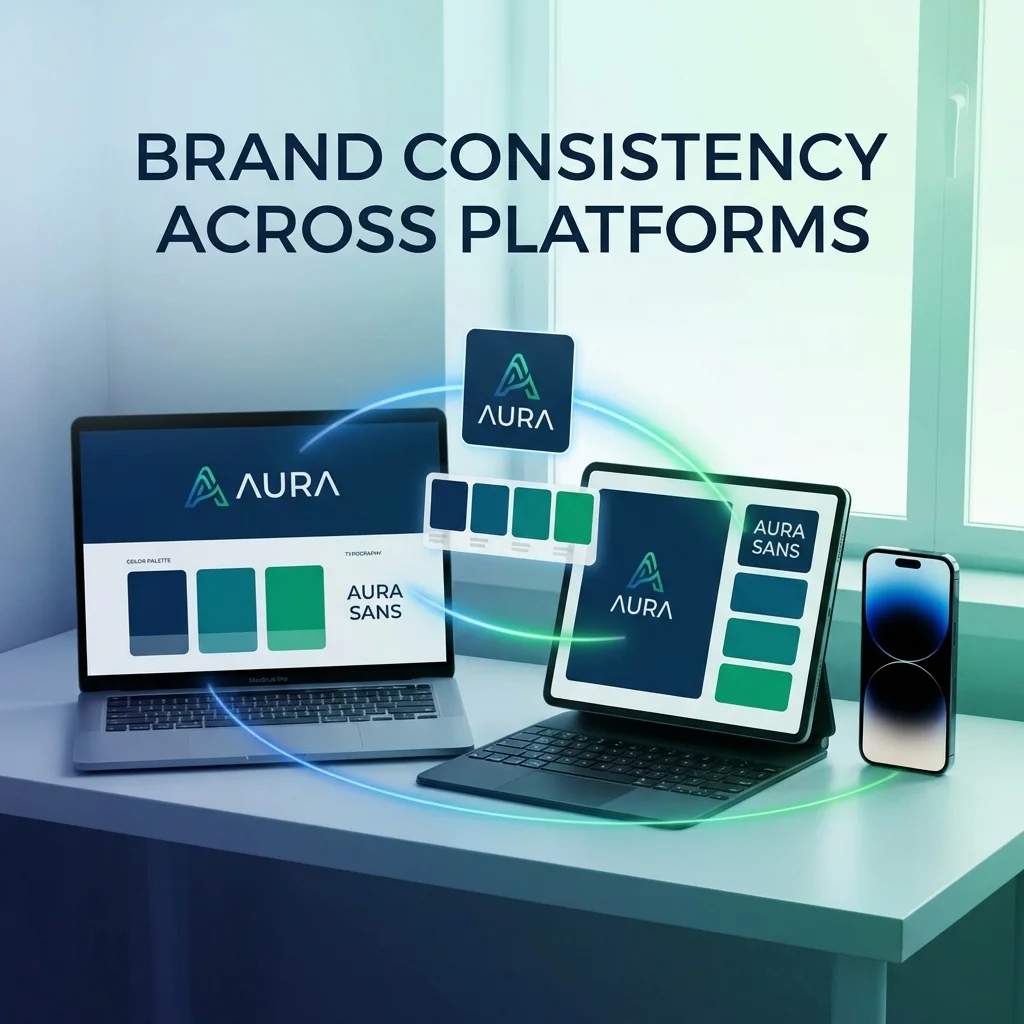
Building Your Brand System
A brand system is your documented approach to visual identity. It doesn't need to be elaborate—it needs to be clear and accessible.
The Minimum Viable Brand System
Document these elements:
Colors
| Element | Color | Hex Code | Usage |
|---|---|---|---|
| Primary | (Your main brand color) | #XXXXXX | Headlines, CTAs, primary buttons |
| Secondary | (Supporting color) | #XXXXXX | Accents, secondary elements |
| Background | (Background color) | #XXXXXX | Page backgrounds, cards |
| Text | (Main text color) | #XXXXXX | Body copy |
| Error/Alert | (Typically red) | #XXXXXX | Error states, urgent messages |
Critical: Include the exact hex codes. "Our blue" means nothing; #1E40AF is specific.
Typography
| Use Case | Font | Weight | Size (Reference) |
|---|---|---|---|
| Headlines | (Font name) | Bold/600+ | 24-48px |
| Body text | (Font name) | Regular/400 | 14-16px |
| Captions | (Font name) | Regular/400 | 12-14px |
| Accent | (If applicable) | As needed | Varies |
Tip: Stick to 1-2 fonts maximum. More fonts = more inconsistency.
Logo Usage
Define:
- Primary logo (and when to use it)
- Secondary/icon version (for small spaces)
- Minimum clear space around logo
- Minimum size for readability
- Backgrounds it can/cannot appear on
Image Style
Describe your visual aesthetic:
- Photography style (warm, cool, saturated, muted)
- Subject matter (people, products, abstract)
- Editing treatment (filters, effects, overlays)
- What to avoid (specific styles that aren't on-brand)
Platform-Specific Adaptations (Not Departures)
Each platform requires some adaptation. The key is adapting format while maintaining identity.
Instagram
Format adaptations:
- Square (1:1), Portrait (4:5), Stories (9:16)
- Text minimal on images
- Carousel format for longer content
Brand consistency:
- Same color palette across posts
- Consistent filter/editing style
- Logo placement standardized (if used)
- Template approach for recurring post types
Facebook
Format adaptations:
- Slightly more text acceptable on images
- Landscape (1.91:1) common for links
- Can include more detailed captions
Brand consistency:
- Same visual system as Instagram
- Consistent profile/cover images across pages
- Same tone in captions as other platforms
LinkedIn
Format adaptations:
- More professional tone expected
- Longer-form text acceptable
- Document sharing (carousel PDFs) popular
Brand consistency:
- Same colors and fonts
- Adjusted tone (more professional) but same personality
- Same key messaging themes
Email
Format adaptations:
- Simple layouts (many clients limit rendering)
- Responsive design crucial
- Text-to-image balance matters for deliverability
Brand consistency:
- Email header matches website/social
- Same buttons, colors, fonts
- Template consistent across campaigns
Google Ads
Format adaptations:
- Very limited space
- Must work at small sizes
- Text must stand alone (headlines) and with visuals (display)
Brand consistency:
- Colors match across display ads
- Headlines match brand voice
- Responsive display uses consistent assets
Website
This is your anchor. All other platforms should feel like extensions of the website, not separate entities.
The Content Creation Workflow
Consistency becomes practical when built into your process.
Step 1: Create Templates
For recurring content types, create templates:
| Content Type | Template Elements |
|---|---|
| Product posts | Background, text placement, logo position |
| Promotional ads | Offer layout, CTA style, color usage |
| Testimonials | Quote format, attribution style |
| Announcements | Banner design, hierarchy |
Templates don't kill creativity—they create guardrails that ensure baseline consistency.
Step 2: Use Shared Assets
Create a centralized asset library:
- Logo files (all versions, formats)
- Color swatches (for design tools)
- Font files (or clear web font links)
- Template files (Canva/Figma/Photoshop)
- Image library (approved photos, graphics)
Make it accessible: Cloud storage (Google Drive, Dropbox) or design platform (Canva Brand Kit, Figma).
Step 3: Review Before Publishing
Establish a quick consistency check before anything goes live:
- [ ] Colors match brand palette?
- [ ] Fonts are brand fonts?
- [ ] Logo used correctly?
- [ ] Image style matches visual guidelines?
- [ ] Tone matches brand voice?
This takes 30 seconds and catches most drift.
Step 4: Conduct Regular Audits
Monthly or quarterly, review all active platforms:
- Screenshot your presence on each platform
- Lay them all side-by-side
- Ask: "Does this feel like one brand?"
- Note inconsistencies
- Fix the most visible issues first
Common Consistency Challenges (and Solutions)
Challenge: Multiple Team Members Creating Content
Solution:
- Document guidelines clearly (see above)
- Create templates for common content types
- Brief all team members on brand standards
- Review/approve workflow for significant content
Challenge: Platform Feature Temptations
Every platform offers features like special fonts, stickers, effects. They're tempting but rarely on-brand.
Solution:
- Define which native features are approved
- Generally avoid platform-specific text effects
- Use native features for function, not style
Challenge: Seasonal Campaigns
Valentine's Day, Diwali, Christmas—these often come with their own visual language that may conflict with your brand.
Solution:
- Create seasonal color accents that complement (not replace) brand colors
- Maintain brand fonts even when adding festive elements
- Keep your logo consistent even in seasonal contexts
- Create seasonal templates that are still recognizably you
Challenge: User-Generated Content
Customers share content featuring your brand but in their own style.
Solution:
- Don't try to control UGC (that defeats the purpose)
- When reposting, add your brand frame/border
- Use UGC as-is in dedicated spaces (stories, highlights)
- Keep curated feed consistent even if stories are varied
Challenge: Legacy Content
Old posts, ads, and materials in outdated branding.
Solution:
- Prioritize high-visibility updates (profile images, pinned posts, active ads)
- Archive or update old high-traffic content
- Accept that a gradual transition is okay
- Don't let perfect be the enemy of progress
The Brand Consistency Stack
Tools that help maintain consistency:
Design Tools with Brand Features
| Tool | Brand Feature |
|---|---|
| Canva | Brand Kit (Pro feature) |
| Figma | Shared styles and components |
| Adobe Express | Brands and branded templates |
| Avocad | Brand DNA extraction and consistent generation |
Asset Management
| Tool | Purpose |
|---|---|
| Google Drive/Dropbox | Simple file sharing |
| Brandfolder | Brand asset management |
| Frontify | Brand guideline hosting |
| Notion | Documentation and guidelines |
Scheduling and Publishing
| Tool | Benefit for Consistency |
|---|---|
| Buffer/Hootsuite | Preview across platforms before posting |
| Later | Visual feed planning |
| Sprout Social | Approval workflows |
Measuring Brand Consistency
How do you know if you're consistent enough?
Qualitative Check
Show someone unfamiliar with your brand content from 3 different platforms. Ask:
- "Does this look like the same company?"
- "What words would you use to describe this brand?"
If answers are consistent, you're on track.
Quantitative Indicators
| Metric | What It Indicates |
|---|---|
| Brand recall surveys | Are people remembering you correctly? |
| Engagement rates across platforms | Consistent = similar engagement patterns |
| Customer feedback | Confusion about brand = inconsistency showing |
Starting from Messy: The Cleanup Plan
If current presence is inconsistent, here's how to clean up:
Phase 1: Document What You Want (Week 1)
- Create or update brand guidelines
- Define templates for key content types
- Centralize approved assets
Phase 2: Fix the Highest-Impact Areas (Weeks 2-4)
- Update profile images and covers (all platforms)
- Update pinned/featured content
- Pause and rebuild active ad campaigns
Phase 3: Implement New Process (Ongoing)
- Apply templates to new content
- Run consistency check before publishing
- Brief team on new standards
Phase 4: Clean Up the Long Tail (Over Time)
- Archive heavily off-brand old content
- Update key evergreen content
- Accept that complete cleanup is gradual
The Long-Term Mindset
Brand consistency isn't a project—it's a practice.
The goal isn't rigid uniformity (that would be boring). The goal is recognizable cohesion. Someone should be able to see your content and know it's you before they see your name.
This happens through:
- Clear guidelines that everyone follows
- Templates that make consistency the default
- Regular review to catch drift
- Intentional adaptation (not lazy variation)
The businesses that build this discipline compound their marketing investment over time. Every touchpoint reinforces the last. Recognition builds. Trust grows.
That's the payoff for paying attention to consistency.
Struggling to maintain consistency across ad campaigns? Avocad analyzes your Brand DNA and generates ads that stay true to your visual identity, automatically. See it in action at avocad.xyz.
— The Avocad Team